Typography Posters
Approach:
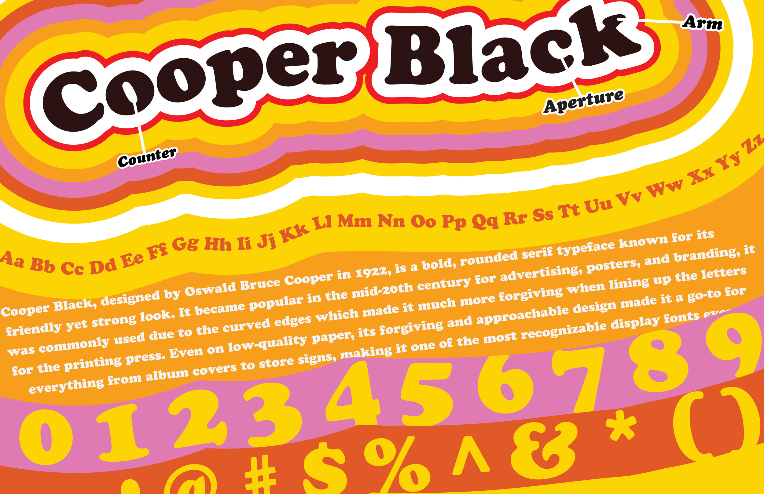
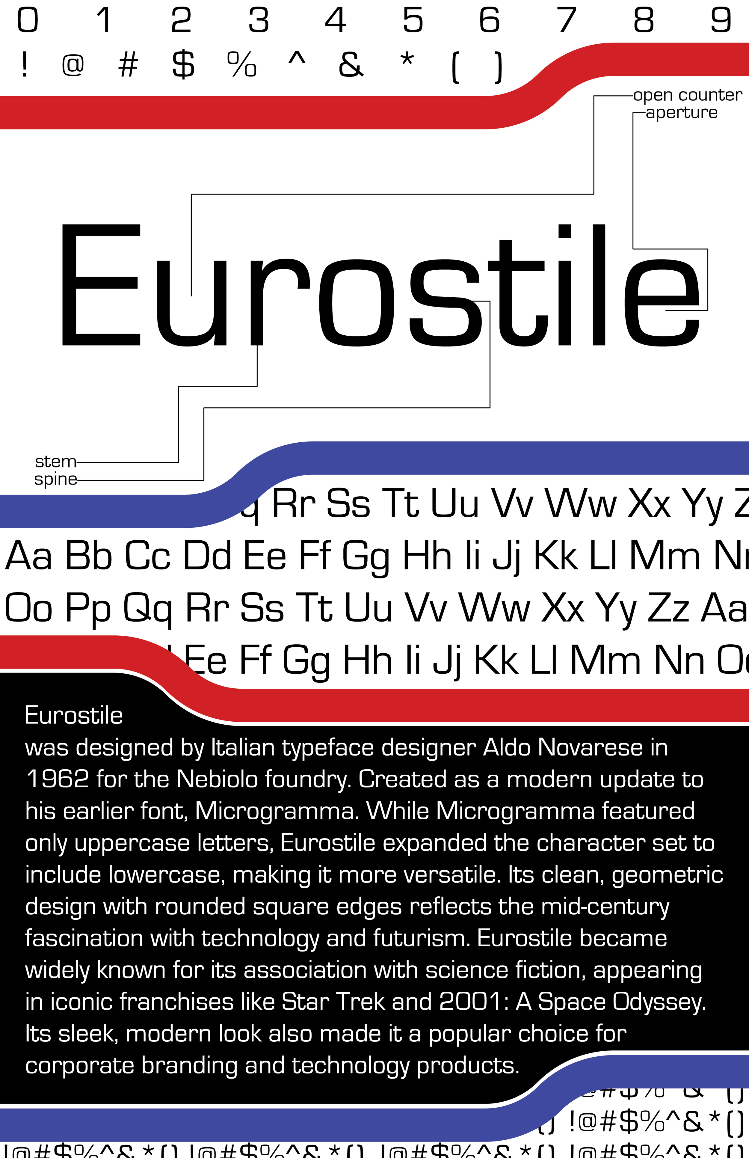
Cooper Black and Eurostile were chosen due to their opposing design aesthetics. The goal was to design the two posters to contrast the designs of the past and the future. I also wanted to ensure that I showcased all the letters, numbers and special characters in both typefaces; while including a small paragraph about the history of the typeface as well.
Process:
The Cooper Black poster was inspired by the now retro of the late 60s, taking inspiration from the different uses of cooper black in things like tootsie rolls, early Garfield comics, and The Beach Boys album cover for ‘Pet Sounds’ Early challenges when designing this poster was where to put the numbers and letters, and how to incorporate the paragraph description in such a non-uniform space. The design for the Eurostile poster was inspired by the futuristic look of Si-Fi media such as Star Trek and 2001: A Space Odyssey. The red and blue borders breaking up each section were actually inspired by transit maps like the NYC Subway and the Tube used in London.
Results:
The final look creates an interesting design for both. The Cooper Black poster is reminiscent of the late 60’s colorful counter culture at the time. The Eurostile poster provides a direct contrast, being very futuristic uniform design